How to Create Perfect Payment Forms in WordPress (9 Easy Tips)
Last updated on

Do you want to create the perfect payment forms for your WordPress site?
Your payment forms represent the moment your visitors decide whether your business is trustworthy enough to complete a purchase.
To maximize your conversions, grow your business, and establish your brand, you’ll need to design payment forms with a tool that gives you complete control and flexibility.
In this article, we’ll go over nine tips to help you create the perfect payment forms for your business.
Table of Contents
1. Keep Your Visitors on Your Site
If you’re like most businesses, you’ve spent a lot of time and energy to get more traffic on your site. Taking this into consideration, it would be counter-productive to send visitors to another site to complete a payment. This is because once they finish the payment process, there’s a good chance they won’t bother returning to your site to continue exploring your content or products and services in the future.
Some payment processors require customers to checkout on their hosted payment pages. This not only strips away control over your checkout pages, but it can also cause your customers to abandon the process once they realize they’re being sent to a completely different site to complete the payment.
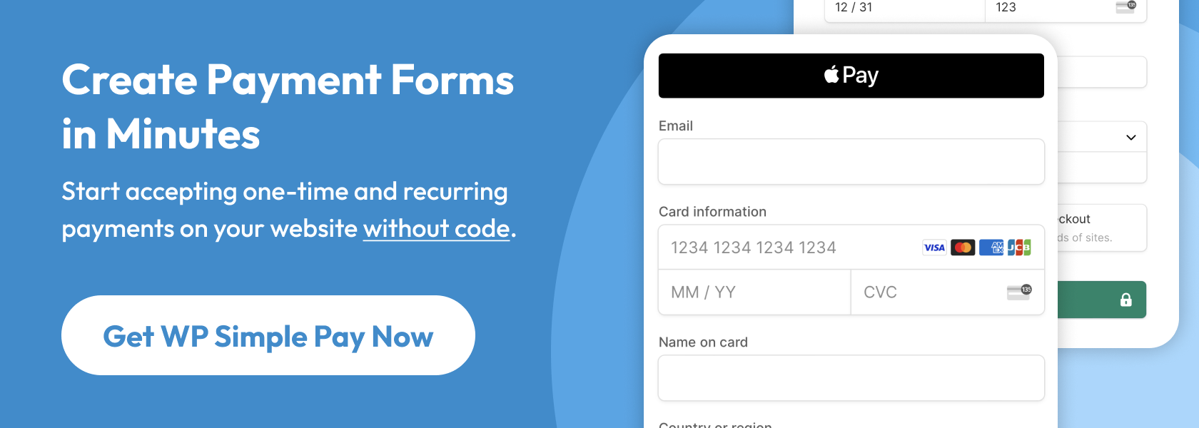
This is why we recommend using a payments plugin for WordPress that allows you to easily create on-site payment forms and accept payments without ever asking your customers to leave your site.
WP Simple Pay, the #1 Stripe payments plugin, offers an advanced drag-and-drop payment form builder to help you customize your payment forms and then easily add them to your site.
With WP Simple Pay’s on-site payment forms, your customers can make their payments without ever leaving your site.
The plugin also lets you design a dedicated, distraction-free payment page for your payment forms without using code.
2. Offer Multiple Payment Methods
To ensure that you are catering to a wide range of potential customers, you’ll need to offer multiple payment methods.
Recent research done by Stripe reports that 85% of online customers said they would stop a purchase if their favorite payment method wasn’t an option. Yet, there are still sites out there that only accept one form of payment. These sites are leaving money on the table!
WP Simple Pay allows you to accept over 10 payment methods, including credit and debit cards, ACH Direct Debit, Cash App Pay, Apple Pay / Google Pay / Microsoft Pay, Alipay, and more.
One of the best parts about the plugin is that it lets you offer as many available payment method options as you want on a single payment form. This makes it super easy for your customers to simply choose their payment method during checkout.
3. Don’t Require an Account Unless You Have To
Requiring people to set up an account before they make a purchase is a great way to frustrate your customers and turn sales away.
A key reason why people dislike setting up accounts is because they worry they’ll be flooded with promotional emails.
Truthfully, that’s a reasonable concern because it happens all the time.
Your customers don’t want another username and password to remember. They often don’t feel the need to create an account because they wouldn’t have to in a brick-and-mortar store.
Plus, they worry if they make an account with you, you’ll just collect a bunch of their data.
Make your customers’ lives easier by letting them check out as a guest.
WP Simple Pay lets you customize your payment forms to allow your customers to complete purchases without setting up an account.
However, if you own a subscription-based business, or a membership site, creating a user account in WordPress is often required to give access to paid content or courses. Allowing your subscribers to manage their own renewals and subscriptions is also a great solution in some cases to eliminate customer churn and save you a lot of time.
For these instances, WP Simple Pay offers a built-in integration with Uncanny Automator that allows you to automatically create a new user account in WordPress as soon as your customer signs up and completes their payment.
This flexibility is unlike most eCommerce payment solutions that require you to build a full-fledged membership site with a lot of features you don’t necessarily need, like a shopping cart.
4. Assure Customers Their Data Is Safe
Frankly, in an age when financial information is constantly stolen and abused, people have the right to be fearful.
You can make your customers feel comfortable about inputting their financial information by:
- Keeping them on your site (rather than a hosted, third-party site).
- Installing an SSL certificate on your site so all information that passes back and forth is encrypted.
- Complying with PCI Security Standards. WP Simple Pay uses Stripe’s PCI-compliant servers for payment processing and storage.
- Use social proof tools to show your visitors that others are buying from you.
- Add trust badges and security seals to your site.
5. Ask Simple, Logical Questions
Payment forms are not the place for ambiguous questions or hard-to-decipher language. If your customers don’t know how to answer your questions, they’ll likely buy somewhere else.
Take a look at this form’s language. The phrase “We would like to know” is unnecessary because obviously the company wants to know.
“Prefer” in the second question is confusing. Are we ordering the selected box? If the business doesn’t have it, will we get a different kind? Also, “Please select your preference below” is unnecessary.

Simplify and reduce your questions wherever possible. Don’t serve them a paragraph when a sentence will do. Before publishing your form, have a friend or colleague read it once. Ask them if they understand exactly what you’re asking for.
6. Remove Unnecessary Fields
By the time your customers decide to spend money with your business, the best thing you can do is get out of their way. That means you should avoid placing unnecessary obstacles before them, like form fields that aren’t necessary.
A study by Google revealed that people view complex designs as unappealing. Psychologically, we prefer to interact with sites that are simple and user-friendly.
In today’s data-obsessed culture, it’s tempting to try to collect little pieces of information you can use later. You may want to use that data to segment and personalize your marketing efforts.
But, for the sake of conversions, it’s always smarter to simplify your payment forms as much as possible.
WP Simple Pay offers customizable form fields to ensure that you’re optimizing your forms for your specific business and providing a smooth checkout process for your customers.
7. Identify Customer Errors
People inevitably make mistakes when they fill out forms. Oftentimes, they forget one digit in their credit card number or neglect the “.com” in their email address. When they submit a field improperly, you’ll have to point it out so they can fix their mistake.
If your payment form refreshes, make sure it doesn’t clear the customer’s other information. They’ll grow frustrated if they have to re-complete the entire form because they made a mistake in a single field.
Also, be sure to display the error message in or just below the incorrect field. If the error message displays at the top or bottom of the form, the customer might not understand where they made a mistake.
Notice how this form indicates exactly which field contains the error so the customer can fix it quickly and painlessly.

8. Display a Clear Call-to-Action
When your customers finish inputting their information, you don’t want them to wonder what’s next. So, the last step in designing the perfect payment form is to give your customers a clear call-to-action button.
Use an obvious color, something that matches your website’s theme, but still stands out.
Avoid ambiguous phrasing like “Next” or “Continue” in favor of clear language, like “Buy Now,” “Pay Now,” or “Submit Payment.”
With WP Simple Pay, you can customize your call-to-action buttons directly from the payment form builder. To learn more about call-to-action buttons, see our guide on how to optimize product & services pages in WordPress.
9. Create a Thank You Page
A “Thank you for Your Payment” popup isn’t sufficient. You need a dedicated page on your site that makes your new customer feel comfortable about their purchase.
Keep in mind that they still have a little lingering anxiety over sending you their money. For the sake of the relationship, you should remove any remaining fears.
Your landing page should…
- Thank them explicitly for their purchase.
- Confirm any important details.
- Inform them of any next steps (what they need to do or what you’ll do).
- Give them other ways to interact with your brand (like following you on social media, reading your blog content, or subscribing to your eNewsletters.
Using WP Simple Pay, you can easily create custom payment flows for individual payment forms. This means that if you offer products or services that require additional steps, you can customize your payment confirmation messages and emails to inform your customers what’s next.
In addition, the payment forms you create using the plugin offer automatic phone number validation to help you send notifications regarding orders via SMS.
That’s it! We hope this article has helped you learn how to create the perfect payment form for your WordPress site.
If you liked this article, you might also want to check out our guide on Common WordPress eCommerce Mistakes to Avoide in 2023.
What are you waiting for? Get started with WP Simple Pay today!
To read more articles like this, follow us on X.
Disclosure: Our content is reader-supported. This means if you click on some of our links, then we may earn a commission. We only recommend products that we believe will add value to our readers.