Top Customer Complaints About Payment Forms
Last updated on

Wondering about what some of the most common complaints are about payment forms?
As you’re well aware, your payment forms play a critical role to the success of your eCommerce business. They represent the moment your visitors become customers, so it’s imperative that you get them right.
Unfortunately, many payment forms fail to meet customers’ standards for several different reasons. If your customers have a question, fail to understand something, or grow frustrated with your form, there’s a strong chance they’ll abandon your site and take their business to one of your competitors.
In this article, we’ll go over a few of the most common issues customers have with payment forms. Do any of your customers make these complaints?
- 1. “I’m not sure I trust this site.”
- 2. “This site is slow.”
- 3. “That’s not the price I expected.”
- 4. “You don’t know my credit card provider?”
- 5. “Ugh, you don’t let me pay with X.”
- 6. “Why do they need that?”
- 7. “This is so complicated!”
- 8. “I don’t understand…”
- 9. “There are too many upsells.”
- 10. “Which field is wrong?”
1. “I’m not sure I trust this site.”
Trust is a key component to the customer experience. People won’t send you their hard-earned money if they think you won’t uphold your end of the deal or protect their sensitive financial information.
This is just one of many reasons we urge you to use the best payment processor, Stripe. Customers will see the Stripe logo and give you the same level of trust they have for the most-recognized payment processing provider.
Part of your checkout design (images and copy) should provide evidence that you’re trustworthy. Apply trust badges throughout your entire site, including…
- Credit card logos
- Awards and honors
- Logos of customers, partners, or clients
- Customer satisfaction badges
- Security seals
- App store logos/buttons
- Testimonials from past customers and clients
- Anything else that associates you with something your customers already trust
We also recommend posting recent sale notification popups on your site to build trust in your products or services. With WP Simple Pay, the #1 Stripe payments plugin for WordPress, you can easily create an automation that posts new sales in real time directly on your site. See our step-by-step guide to learn how to do it without using a single line of code.
2. “This site is slow.”
When a customer reaches checkout, they’ve completed the fun part of the buying process. They’ve enjoyed browsing your products and services, but checkout is a necessary chore to get what they want. If you make that chore harder by forcing them to sit while your page loads, there’s a good chance they’ll abandon your site for another.
According to Google, a whopping 90% of online shoppers abandon checkout pages that take too long to load. Even just a one-second delay can reduce your conversions.
Not sure if your checkout pages are loading fast enough? No worries! You can check your speeds and get recommendations here.
3. “That’s not the price I expected.”
There’s a good chance your customers will leave your payment form if it displays a price they don’t expect. In fact, unexpected costs are one of the top reasons people abandon the payment process and checkout pages.
What’s interesting is that people are usually willing to pay the price – as long as you show it to them before you ask them to pay. But they’ll grow suspicious of you if you wait until the end to show them the real total.
The solution is simple: Show your customers all the costs upfront, including extra fees, delivery charges, regional taxes, etc.
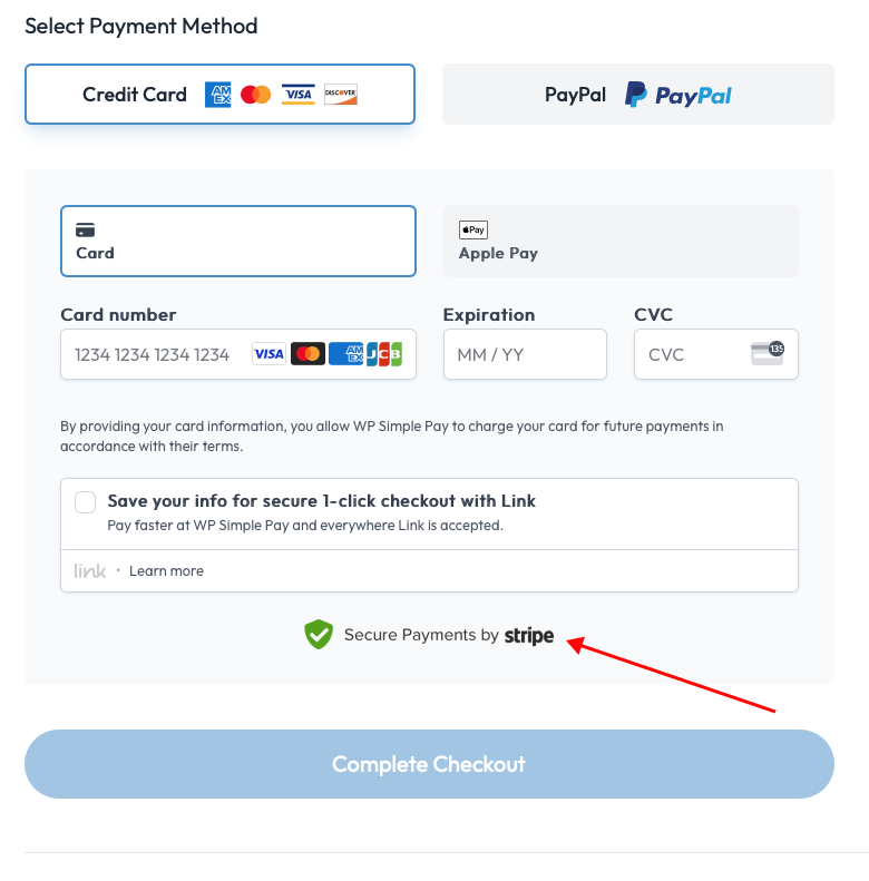
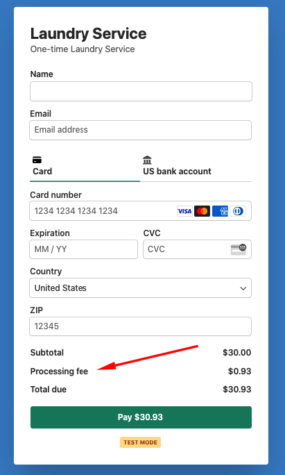
Using WP Simple Pay as your payments plugin, you can easily customize your payment forms to have a fee breakdown to let your customers know exactly what they’re being charged for.
Directly from the advanced drag-and-drop form builder, you can easily add the Amount Breakdown custom field to your form.
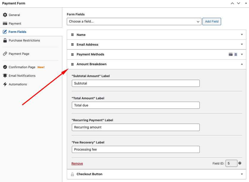
You’ll notice that the payment form displays the additional processing fee right above the total cost.
4. “You don’t know my credit card provider?”
There’s no need to ask your customers for the name of their credit card provider. You can determine that based on the first numbers of the card, so it’s best to eliminate this field.
If you’re using WP Simple Pay to create your payment forms, you can skip all the unnecessary questions so nothing distracts your customer from completing the payment process.
Because the plugin supports Stripe’s Universal Payment Element, you can even allow your customers to use Stripe Link during checkout. This lets them complete their purchases faster using saved payment details.

5. “Ugh, you don’t let me pay with X.”
Imagine how frustrating it would be for a customer to reach the end of the checkout process only to learn that they can’t pay with their preferred method. No one is going to open a new account or sign up for a credit card just to make a purchase on your site. They’ll just go find someone else who will take their money.
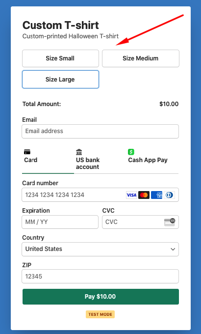
This problem is especially infuriating for customers if you don’t take a common payment method, such as traditional credit and debit cards, ACH Direct Debit, or digital wallet options like Apple Pay.
Offering multiple payment methods is key to getting more sales. It also makes your customers more comfortable about their purchases. If a customer gets to use their trusted Visa card, they’ll be far more likely to trust using it with you.
This is why WP Simple Pay lets you accept multiple payment methods, including Cash App Pay, Apply Pay / Google Pay/ Microsoft Pay, ACH Direct Debit with micro-deposit verification, Alipay, and so many more.
6. “Why do they need that?”
Your customers expect to give out some of their personal information during the checkout process. I understand that you need their name, billing address, and a few other data points. But, if your customers can’t understand why you need a particular piece of data, they could become wary.
For example, let’s say you’re a marketing consultant. You ask all the usual questions on your payment form, in addition to one other: “Which operating system do you use?” The answer to this question helps you recommend additional software products, but your customers may see it as unnecessary. They may question why you need a data point like that.
The best solution is to only ask for what you need to keep the process moving. You can always ask for additional information later. If you absolutely must ask an additional question, provide plenty of context on the page so the customer understands why you need it.
Let’s say you own a subscription-based business that offers different pricing plans. Using WP Simple Pay, you can easily list the different pricing options on one payment form.

Additionally, if you sell custom-made products with variations or you work for a non-profit organization that needs to raise funds, you can create text fields directly in the payment form builder that allow your customers or donors to add notes regarding their specific orders.
The plugin also allows you to include dropdowns, checkboxes, or lists to make the process easier.
7. “This is so complicated!”
Payment forms should be simple and smooth. Your customers should never doubt what they’re supposed to do or what comes next. The whole process should be linear and straightforward.
In many cases, this means stripping your site of extra elements that distract them from the payment process. Don’t give your visitors the option to click to a new page or browse new products or services because they may not ever find their way back to to the payment page.
This is why WP Simple Pay offers three different form types, including an overlay modal, on-site, and Stripe Checkout. You can also create distraction-free landing pages designed specifically for your payment form directly from the payment form builder.
In most cases, it’s best practice to limit the number of form fields to three or four. This ensures that you don’t annoy your customers with too many questions, and also that you collect the information you need.
Simplifying your payment process also means not using CAPTCHA. Verifying that a human is behind each form submission is important, but CAPTCHA is arduous and tedious for users because they have to solve equations, type random letters and numbers, or identify “all the pictures with a mailbox.”
Instead, use reCAPTCHA, a tool to prevent non-humans from interacting with your page that doesn’t annoy your customers. All they have to do is click a box.
WP Simple Pay offers tons of pre-built payment form templates for you to choose from to help ensure that you’re using the best custom fields and settings possible.
8. “I don’t understand…”
This is a general complaint that applies to a lot of situations. Basically, customers aren’t likely to complete the payment process if they have a question about the price of their product, the shipping, or some other variable. It’s your job to make them comfortable by answering all of their questions long before check out.
Now, obviously you can’t anticipate and pre-resolve every possible objection. So, it’s important to give your customers a way to contact you if they have any issues with your payment form. Place an email address prominently on the page or add a live chat feature to your site.
9. “There are too many upsells.”
It’s one thing to prompt your customers with one or two upgraded products or services during the checkout process. But, it’s not smart to force your customers to click or scroll through a dozen offers before they can buy the thing they originally wanted.
If you put too many upsell offers in front of your customers, not only do you extend the checkout process (which is detrimental to your conversions), you also make the customer or client concerned that you only see them as a wallet.
Choose and display one or two upsell offers that are the most valuable to your client. Don’t ask them to turn a $100 purchase into a $500 purchase, to buy a completely unrelated product or service, or to suddenly commit to a long-term subscription plan.
10. “Which field is wrong?”
Sometimes your customers will input bad information into your payment form. For instance, they might submit a credit card number with too few digits, or an expiration date or email address in the incorrect format.
This kind of thing happens all the time, but it’s not a big deal as long as you tell the customer which field is incorrect. If your form only gives a generic “Invalid field” error without directing the customer to the bad field, your customer won’t know what to correct without going through the form again. That’s incredibly frustrating and may cause customers to abandon checkout altogether.
Ensure that whichever technology you use to power your payment forms validates each field, preferably as the customer uses it. This way they’ll know where to correct their mistakes so they only have to submit once.
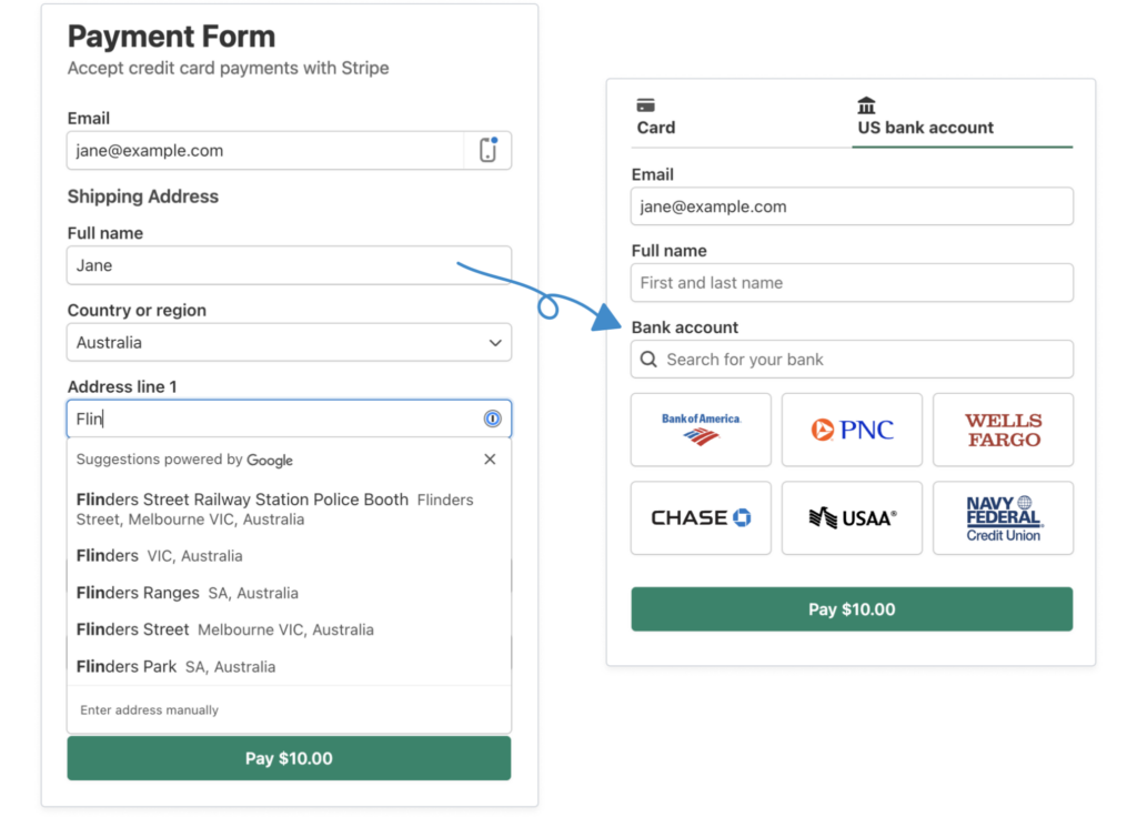
To eliminate errors and make the checkout process much faster, payment forms created with WP Simple Pay can auto-complete shipping and billing addresses and automatically validate the customers’ phone number.
There you have it! Now that you know what your customers may not like about your payment forms, you can implement the needed changes to improve the checkout experience and ultimately grow your business.
If you liked this article, you might also want to check out our guide on how to optimize product and services pages in WordPress.
What are you waiting for? Get started with WP Simple Pay today!
To read more articles like this, follow us on X.
Disclosure: Our content is reader-supported. This means if you click on some of our links, then we may earn a commission. We only recommend products that we believe will add value to our readers.