How to Create the Ideal Checkout Experience On Your WordPress Site
Last updated on
Do you want to create the ideal checkout experience on your WordPress site?
Undoubtedly, online businesses need to spend some time and energy optimizing their services, products, and informational pages, which is why we have created several helpful tutorials and guides to help you get started.
With all of that being said, the entire process of purchasing on your site (the checkout experience) is also an essential part of your business that deserves a lot of thought and attention.
In this article, we’ll cover what the three elements of a great checkout experience are and how to improve them.
In This Article
Creating the Ideal Checkout Experience
Unfortunately, online businesses sometimes make the mistake of assuming that their visitors are ready to make a purchase as soon as they land on their site.
This assumption can lead to a complicated checkout experience that drives potential buyers away.
Let’s take a look at the three essential parts of the checkout experience. Making a few corrective adjustments to these three areas of your checkout process can make all the difference between paying customers and high checkout abandonment rates.
Part 1: Checkout Page
The checkout page is where your customers enter their payment and shipping details. It’s where they take the plunge and decide to send you their money.
Take extra care when you design this page. Just because the customer lands on it doesn’t mean he or she is 100% comfortable making a purchase. They always have the opportunity to back out until they hit the “Buy Now” button.
Your checkout requires a few basic elements:
- Billing information
- Shipping information (if applicable)
- The customer’s order (as a reminder)
- A “Buy Now” button
Many businesses don’t require a full eCommerce solution with a shopping cart to accept payments. This is usually because they don’t offer a lot of products or the organization could just be a nonprofit looking to raise funds for its cause.
For example, a consultant who books one-hour phone calls doesn’t need a complex eCommerce store to collect payments. He or she simply needs a payment form.
In cases like this, a simple Stripe payments plugin for WordPress like WP Simple Pay not only facilitates the payment processing, it also gives you greater control over your checkout page.
WP Simple Pay lets you easily customize your payment forms, choose between an on-site payment form and an off-site payment form, and even create a distraction-free landing page that hosts your payment form. It also offers tons of pre-built payment form templates designed to help you get your forms live on your site in minutes without using a single line of code.
Because you aren’t bound by a shopping cart’s layout and design with WP Simple Pay, you can put anything you like on the checkout page, including testimonials, reviews, FAQs, and even your logo.
Part 2: Payment Confirmation Page
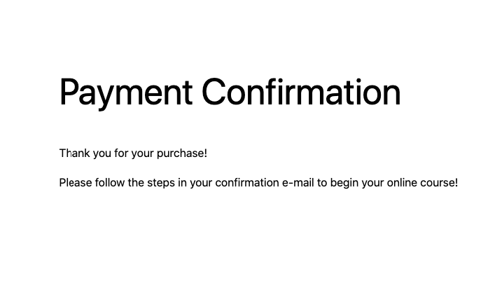
The payment confirmation page is the page your customers are redirected to after they make a purchase. It may seem like an unnecessary step, but this page’s purpose is to provide your customers with validation.
Buying online comes with a certain level of anxiety for your customers because they can’t be completely sure they’ll get what they purchased. On some level, they have to trust that you’re an honest business that will deliver what you promise.
Your payment confirmation page confirms the purchase and reassures your customers that they’ve completed the purchasing process. Sure, you could give them a simple success message on the checkout page, like “Thanks for submitting your order!” but a new page feels more like the transition they’re looking for.
Generally, payment confirmation pages include a big “Thank you” at the top of the page. People like being thanked.
You should also remind them of what they just purchased. Even though they just bought it, the confirmation makes it clear that you understand your obligations now. If the customer paid for a month’s worth of service, the ball’s now in your court to provide it.
Here are a few more ways to get more value out of your confirmation page:
- Offer upsell, cross-sell, and add-on opportunities. Make it clear that if they buy now, they can get everything delivered in the same box/month/time/way.
- Ask them to sign up for your newsletter or connect with your social media pages.
- Have them add or edit their account details.
- Serve them some related content to get the most out of their purchase.
- Ask them to complete a survey about their shopping experience.
Using WP Simple Pay’s advanced payment form builder, you can easily create a personalized payment confirmation message that will be displayed on a custom confirmation page.
You can set these messages up for individual payment forms. This means that if you offer several different products or services, you can customize your messages to align with each separate payment form.
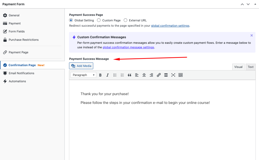
Once your customer has completed the transaction, the payment confirmation message is automatically displayed on the custom confirmation page.
Part 3: Email Receipt (Optional)
While you don’t have to send your customers an email receipt, it’s strongly recommended.
Emailed receipts serve a few purposes:
- They give your customers a record of the transaction.
- They make the customer feel comfortable about the purchase.
- They tell the customer what actions or next steps they need to take.
- They create an email-based relationship.
- They put pertinent information right in the customer’s inbox.
Instead of thinking about email receipts as necessities, think of them as opportunities. Email receipts have a 71% open rate, which is far higher than the average 17.2% open rate of other email marketing campaigns. This means it’s the one email nearly all of your customers will read.
Email receipts are great places to…
- Request product reviews
- Promote other products
- Promote upsells, cross-sells, or add-ons
- Request customer testimonials
- Offer a discount for future purchases
- Promote your social media accounts
- Have customers share their purchases
- Have customers review your policies
- Explain what your customer should do to use their purchase
WP Simple Pay makes it easy to create customized email receipts that are sent to your customers’ inboxes once payment has been confirmed within minutes.
Similar to creating a personalized confirmation page message, you can edit your email receipt message directly from the payment form builder.

Checkout Experience Best Practices
Here are some best practices to keep in mind as you design your checkout experience.
1. Secure Your Site
SSL certificates reassure your customers that their information is safe. They may not know how SSL certificates work, but they recognize the little lock icon and the word “Secure” in their browser.
Plus, SSL certificates improve your Google rankings, so they’re worth having in place.
2. Keep Customers on the Page
Once your shoppers are on your checkout page (whether it’s a page with a form or an information page with a button that triggers a popup form), it’s important to keep them on that page. Keep any pertinent information nearby so they don’t wander somewhere else.
If you think your shoppers need more information, put that information on the page. Don’t link them to it or they might fail to return to complete their purchase. For instance, you might use expandable accordion dropdowns for your return policy or FAQs.
3. Design for Mobile
When we use a mobile device, we hold them in three basic ways: one-handed, cradled, and two-handed.
In each case, our thumbs play an important part in screen interaction, so it’s important to design a checkout experience your customers can navigate with their thumbs.
This means your checkout page should be easy to scroll, even when covered by half the keyboard.
4. Avoid Long Checkout Pages
If your checkout process is complex (maybe you need customers to select options, input information, or review offers), it’s best not to put it all on the same page. Long pages are frustrating for users, especially when they use mobile devices because their keyboards take up half the screen.
If your checkout process is long, break it into several pages. End each page with a “Next” button until they reach the final “Buy Now” button. This makes the process less intimidating for your customers.
If you can, include a progress indicator at the top of the page to reassure customers that the checkout process isn’t endless.
5. Speed Up the Process
You know that fast pages are important, but they’re especially important at checkout. If checkout pages take longer than three seconds to load, you’ll lose 90% of your shoppers. Mobile users expect checkout pages to load faster than they load on desktop devices.
You can speed up your checkout process by…
- Removing any unnecessary images. If you want to include images of your customers’ products in their cart, use thumbnails, not full-size images.
- Remove unnecessary widgets, like carousels, testimonials, and reviews. Your checkout page(s) should focus solely on making the purchase.
- Remove any third-party scripts that don’t support the checkout experience.
- Install Google’s PageSpeed tools to analyze and optimize your pages.
6. Set Your Tab Index
Customers like to use the TAB button to quickly navigate to the next field. This helps complete forms faster. Test your payment forms to make sure you can logically tab through them.
7. Make Input Fields and Labels Large
No one likes squinting to read your page. Make your input fields (the text boxes where they input their information) and those fields’ labels big enough to read on any device.
8. Include Click-to-Call or Live Chat
Sometimes people want to buy but they can’t find answers to their questions on your site. The checkout page is a great spot to place a clickable phone number or a live chat feature so they can get the information they need to make a purchasing decision.
9. Don’t Require an Account
Forcing new shoppers to make an account before completing their purchase is a big barrier for many people. It’s an unenjoyable obstacle between them and their purchase.
Plus, people are concerned about privacy these days. Even though they don’t mind buying from you, they may not want you to track them.
Give your customers a guest checkout option to speed them through the checkout process.
10. Use Persistent Checkouts
Sometimes shoppers like to browse your site at different times or on different devices. It might take them several visits just to decide to make a purchase. Persistent checkout is when customers’ items stay in their shopping cart for a while, even when they leave the website.
Persistent checkout is important if you have a full eCommerce store, but not that relevant if you use a simple payment form using WP Simple Pay that is good for single or recurring payments.
Going Forward
Your checkout experience is one of the most important interactions your customers will have with your business. When they reach that point, they’ve already overcome several obstacles between them and making a purchasing decision. Follow our advice and best practices to create a checkout experience that maximizes your conversions.
If you liked this article, you might also want to check out our guide on how to create a Stripe payments landing page in WordPress.
What are you waiting for? Get started with WP Simple Pay today!
To read more articles like this, follow us on X.
Disclosure: Our content is reader-supported. This means if you click on some of our links, then we may earn a commission. We only recommend products that we believe will add value to our readers.
