How to Add a Payment Form to WordPress (6 Locations to Embed)
Last updated on
You’re ready to sell some products or services on your website and you’ve built a payment form, but you aren’t sure where to place it. The location of your payment forms can impact your conversions, so this isn’t a decision to make lightly.
In this article, we’ll break down the different locations where you can embed your payment forms in WordPress. We’ll also offer some tips to use your forms effectively in those locations.
6 Locations to Add a Payment Form
1. Checkout Pages
A checkout page is the most obvious location for a payment form. It’s right for any site that anticipates that visitors will purchase multiple items or will want to “save” items by adding them to a shopping cart while they continue browsing. If you have a fully-fledged ecommerce store, it makes sense to use a checkout page.

1.1. Adding a Checkout Page to WordPress
Using WP Simple Pay is the easiest way to build a checkout page on your WordPress site. WP Simple Pay is one of the best WordPress Stripe plugins that makes it easy to build payment forms, like credit card forms, Google Pay/Apple Pay forms, Buy Now Pay Later forms, and more.
With WP Simple Pay, you can either embed a form on your own site or embed it on an off-site Stripe checkout page. All you have to do is to select where you want to embed it with a click.
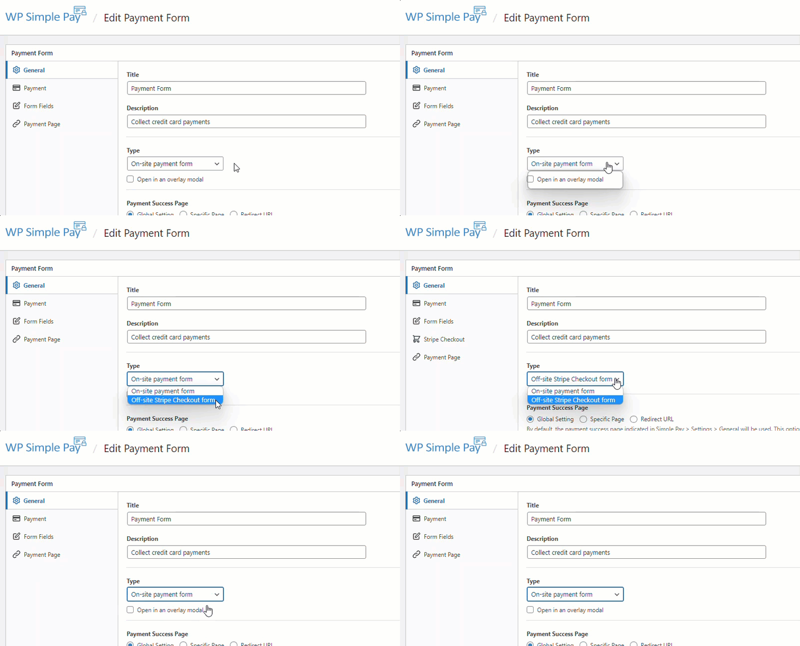
For more details, you can check out the complete guide to setting up a Stripe checkout page in WordPress.
1.2. Checkout Page Best Practices
Your payment form should be the primary element on your checkout page. Don’t clutter this page with extra images, copy, or links that don’t relate to the checkout experience. Anything you add to this page is an opportunity for customers to become distracted and leave. It’s even smart to use a custom header and footer on this page so users don’t have avenues to do something else.
If your customers need any post-sale information, add it to a separate “thank you” page so it doesn’t disrupt your conversion. This might include instructions or next steps to take (like “Check your email after purchasing”), product/service best practices, or how they can contact you if they have questions or concerns.
2. Payment Landing Pages
A landing page is a page designed to be landed on first by your visitors (an appropriate name, right?). For instance, you might buy ads that link to a landing page where the copy of the ad relates to the copy of the page. Your services page could also be landing pages.
Landing pages typically have a single purpose: to convince the visitor to take some kind of action, like contact you, make a donation, subscribe to your email list, or make a purchase. Adding a payment form to this page, as opposed to making visitors click on another page, might be a good way to increase conversions.
2.1. Adding a Payment Landing Page to WordPress
WP Simple Pay lets you easily create a distraction-free payment landing page on your WordPress site. With the dedicated payment landing page, you can ensure high conversions as it removes unnecessary friction on the page, like headers, footers, and more, irrespective of the WordPress theme you use.
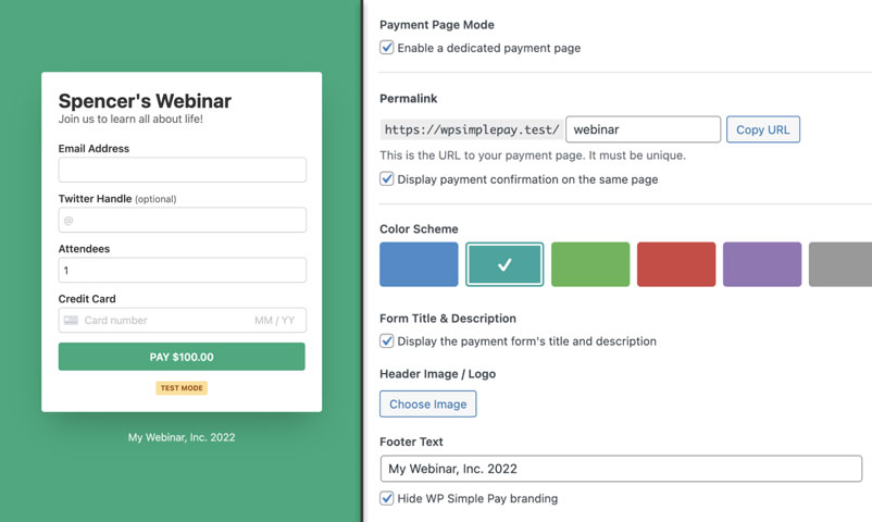
If you decide to add a payment form to a landing page, just make sure the page includes all the information a visitor needs to make a buying decision. Don’t expect visitors to browse around your website searching for answers to their questions. Include a strong headline, supporting copy, frequently asked questions, trust signals, and anything you can add to make your customers feel safe.
Check out: How to create a payment landing page with WordPress
Remove the additional 3% fee!
Most Stripe plugins charge an additional 3% fee for EVERY transaction
…not WP Simple Pay Pro!
3. Product Pages or in Your Content
Product pages:
Product pages are pages that promote a specific product or service. These might be landing pages, but they aren’t always.
Depending on the nature of your products and services, it might be smart to put your payment form directly on the product page, rather than using a traditional shopping cart and checkout flow. This makes sense when you don’t expect visitors to purchase multiple products/services at the same time.
In Your Content:
As you craft content for your readers, you may mention a product or service and want to give them a chance to buy it on the spot. In these cases, it helps to add the payment form directly to the page.
For instance, let’s say you’re writing a blog post. In the article, you refer to your ebook. Instead of linking to another page, you could include a short blurb about the book and a simple payment form to buy it. This ensures you create every possible opportunity for your readers to buy.
3.1. Add a Payment Form to Any Posts or Pages
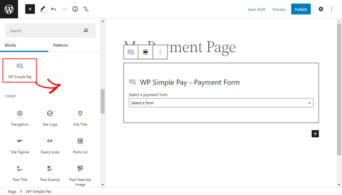
To embed a payment form on any blog posts or pages, just go to the post / page edit screen and then add the WP Simple Pay block to wherever you want to embed it on that post. After adding the block, make sure to choose the right payment form. Then publish the post.
4. Sidebars
In some cases, it makes sense to put a payment form in a sidebar. Since the sidebar is an element that appears on many pages, a form in this location will make it appear throughout your website. This is especially useful if your website has (or will have) a lot of pages and you want that form to be as accessible as possible.
For instance, let’s say you produce regular blog content. Instead of trying to get blog readers over to your ebook landing page, you could promote your ebook in the sidebar of every page. You could include a payment form right below it so readers can buy without taking another step.
If you’re a nonprofit that collects donations, it’s smart to put a payment form in the sidebar so your potential donors can donate as soon as the mood strikes them. This ensures you never miss a donation because the form was inaccessible.
This sidebar payment form is a great example. It appears on multiple pages throughout the site for generous fans to buy this podcaster a coffee.
NOTE: You can easily embed a WP Simple Pay form on your site by copying the shortcode of your form in a sidebar widget where you want to embed it.
5. Footers
Payment forms in footers are rare, but they make sense in some cases. Unlike sidebars that appear on some but not all pages, footers generally appear on every page (except in cases like landing pages where footers are specifically excluded). Therefore, whatever you put in the footer should be something suitable for every page.
Footers are unsuitable places for payment forms that sell products and services that require supporting copy and images. There just isn’t enough space for that kind of thing. But a footer payment form may work if you’re selling a self-explanatory product (like a piece of content) or soliciting a small donation (like “buy me a coffee” or “support us with $3”).
If your site has a widgetized footer area, you can embed the form in the footer by copying the shortcode of the form in a footer widget.
6. Offsite Pages
This isn’t technically an embeddable location, but we didn’t want to leave it out. Your final option is to use an offsite page that’s hosted by your payment processor. A button on your website brings the visitor to a separate page that includes the traditional payment fields. Here’s what a Stripe-hosted checkout page looks like.
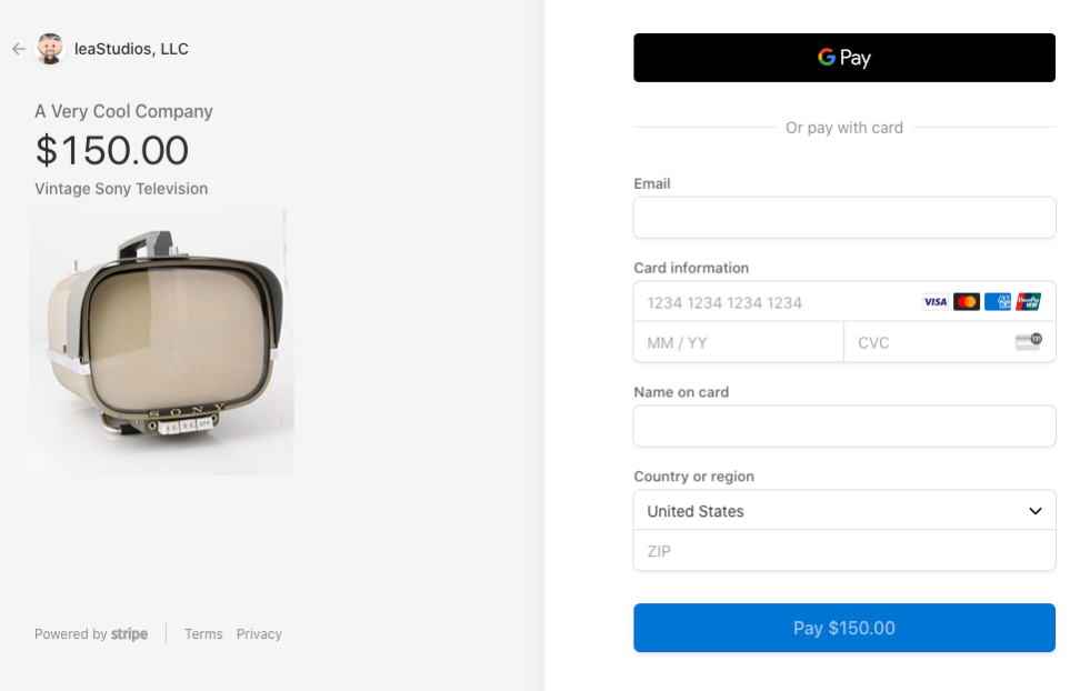
The advantage to this system is that all the page building is done for you by the hosting service. The button to reach this page can exist anywhere, even as a simple text link on a menu or in your content. Plus, the page is hosted by a reputable company that people trust as safe.
We’ve already explained how to add a payment form to Stripe checkout. You can read it from here.
Use WP Simple Pay to Create Payment Forms
As you can see, there are lots of suitable places to embed your payment forms, but the right location depends on the nature and purpose of your form. But in order to have full control, you need a flexible payments plugin that allows you to post forms anywhere.
With WP Simple Pay, embedding a form on your WordPress site is as simple as pasting a shortcode or adding a block. You can also set forms to display as a full-page overlay or use an offsite page. Grab WP Simple Pay today.
To read more articles like this, follow us on Facebook and Twitter.
Disclosure: Our content is reader-supported. This means if you click on some of our links, then we may earn a commission. We only recommend products that we believe will add value to our readers.
