The Basics of an Effective Donation Page
Last updated on
Do you want to create a high-converting donation page on your WordPress site?
Your donation page is the most essential component of your nonprofit site. It’s where your visitors become donors, so this page deserves more attention and optimization than any other page.
In this article, we’ll cover the basics of building your own effective donation page.
Creating a High-Converting Donation Page
A well-designed donation page makes your visitors feel like they are already part of your cause. They need to trust you enough to hand over their money, which means creating a professional experience that shows your visitors that you respect their time and money.
There are a few easy steps you can take to create an effective donation page that accurately represents your mission and ultimately gets more visitors to donate.
Table of Contents
1. No Navigation on Your Donation Page
Your donation page is a landing page, which means it has a single purpose: to convert. In this case, a conversion is a donation.
Whenever you create a landing page, it’s important to limit distractions. You don’t want visitors following paths to other pages. So, it’s important to remove all links to other pages on your site. Donating should be the only option.
Use a special header on your donation page that doesn’t have the usual menu bar or search box. Stick your logo on top, but don’t make it clickable. Eliminate your footer as well. If there is a piece of information donors need to know before donating, put it on your donation page.
WP Simple Pay, the best Stripe payments plugin for WordPress, allows you to create a dedicated, distraction-free donation page using the advanced drag-and-drop payment form builder. You can easily add your organization’s logo and unique color scheme.
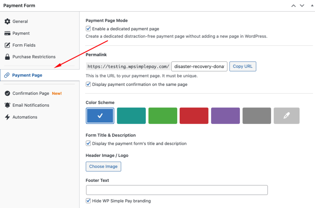
The best part? You can reduce checkout abandonment and boost donations because the page automatically removes distracting elements of your site, including headers and footers.
The plugin offers several pre-built payment form templates for donations, nonprofits, and fundraisers that you can use to get a jump start on your form.
2. Open with a Powerful Headline
Your headline is the most important copy on the donation page. Visitors are more likely to read this line than any other line on the page, so you have to make it as powerful as possible.
On a typical landing page, it’s best to use the headline to explain to the visitor how they will benefit after taking the next step. In terms of a donation page, however, you’ll need to use the headline to explain the effect of the visitor’s donation.
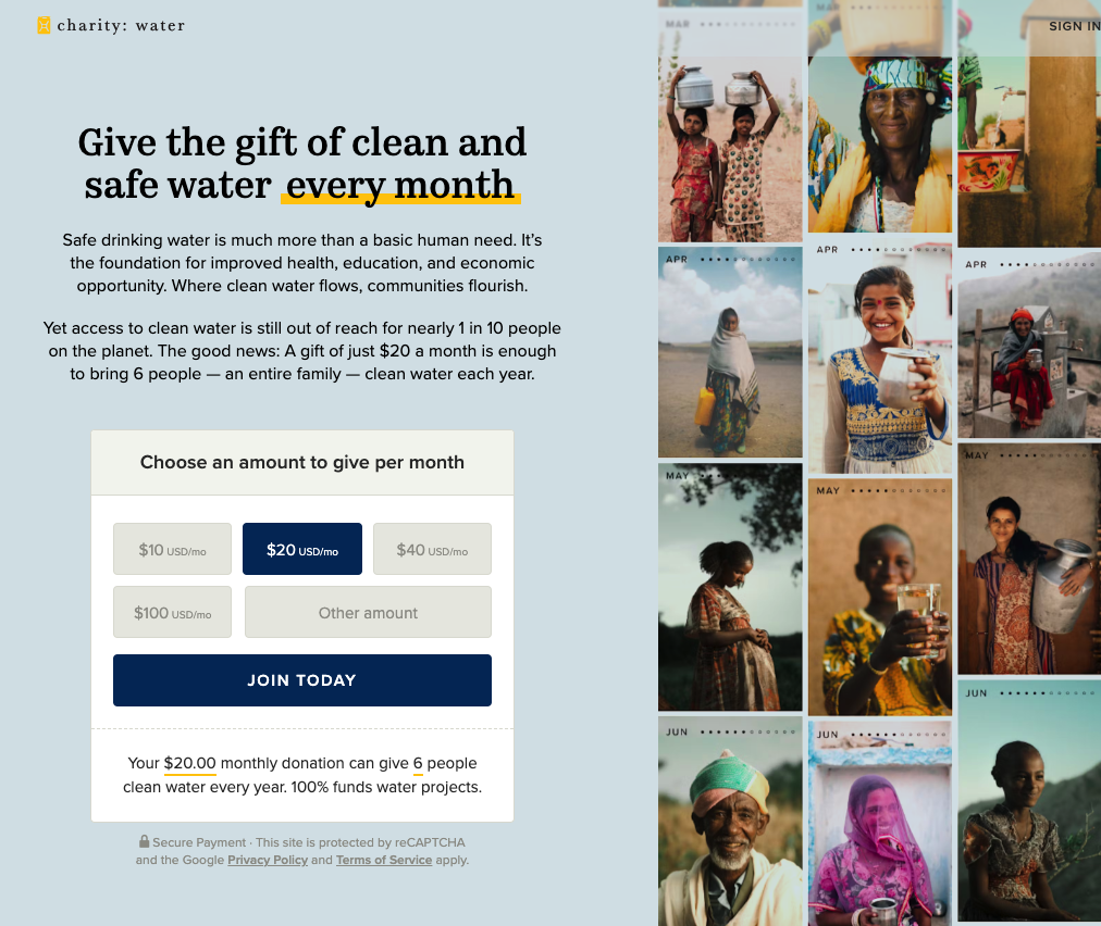
Charity:Water does this especially well.
“Give the Gift of Clean and Safe Water” is a clear benefit most people want to support.
You’ll notice that the organization also included “every month” to encourage donors to opt-in to automatic recurring donations. That’s an important addition because it lets donors know they can become loyal members of your mission.
Long and complex headlines are hard to understand and remember, so keep yours simple and powerful. Resist the urge to explain everything about your organization.
Feel free to include a subheading as well. Use it to expand on your headline’s idea. You can use more words here, but don’t write more than two sentences.
3. Optimize Your Donation Form
When a visitor decides to make a donation, your job is to make the process as easy and painless as possible. That means offering a donation form that’s short, simple, and intuitive. Here are some donation form best practices.
1. Use Form Fields Wisely
Long forms deter visitors, so keep your donation form as short as possible. Do not ask for more information than you need to process their donation. If you want to gather more information about your donors, you can always do that at some point in the future.
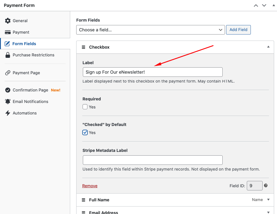
WP Simple Pay lets you add, edit, and remove custom form fields to your form with ease. It’s a good idea to include a checkbox somewhere on your form that asks donors to sign up for your newsletter. This way, your donors will receive updates and news regarding your cause.
2. Offer Suggested Donation Amounts
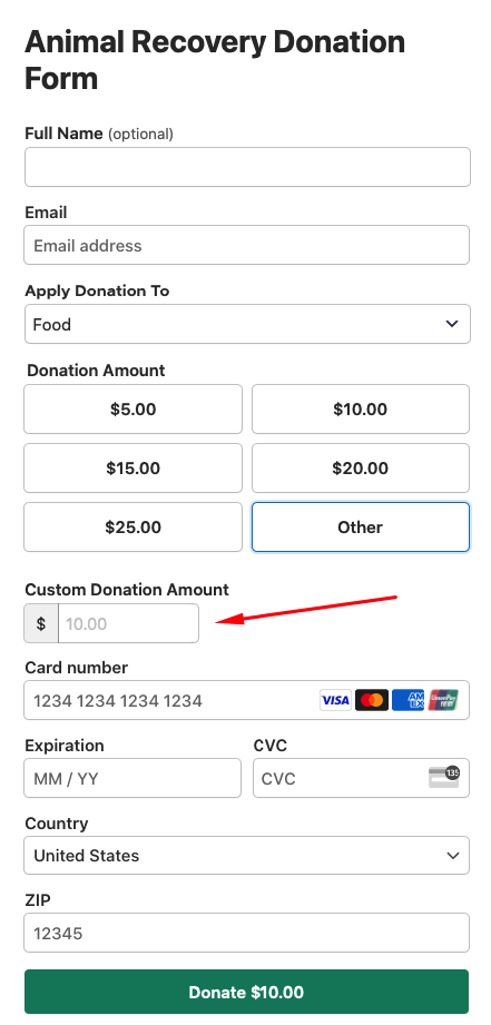
Sometimes, donors aren’t sure how much to give. They don’t want to send a small portion, but they can’t give their whole paycheck either. So, it helps to give them some direction by suggesting donation amounts. Give them several options based on your usual donations.
Here is an example of a payment form with suggested donation amounts.
3. Offer a Recurring Donation Option
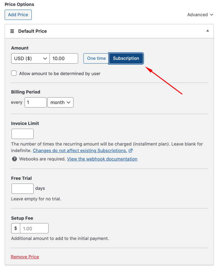
Some donors are happy to donate regularly but won’t if they have to return to your donation page every month. Create an option on your form for them to set up a recurring donation. This makes their life easier and maximizes your fundraising.
WP Simple Pay makes this super easy. Using the plugin’s drag-and-drop payment form builder, simply click on the Subscription tab in the Payment tab and choose daily, weekly, monthly, or yearly.
4. Offer a Custom Donation Option
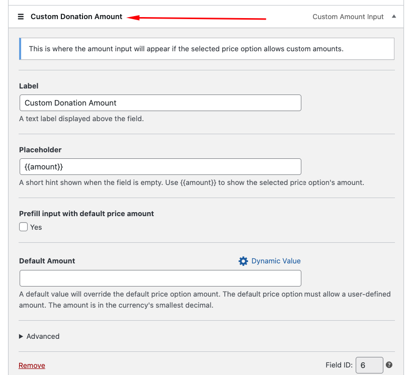
While many donors will stick to your suggested donation amounts, some want to input their own. If you force them to use one of your suggestions, they may donate less than they intend to. Give them the option by simply including a field that allows them to enter their own amount.
With WP Simple Pay, you can add this field from the Form Fields tab.
5. Offer Digital Wallet Payment Methods
Instead of requiring a credit card, give your donors the option to pay with the most popular digital wallets, such as Apple Pay and Google Pay. Many people already trust these institutions, so they’ll feel more comfortable sending their money through them.
WP Simple Pay allows you to accept 13+ payment methods, including digital wallets like Apple Pay / Google Pay / Microsoft Pay, Cash App, Alipay, and GrabPay.
4. Donation Form Placement
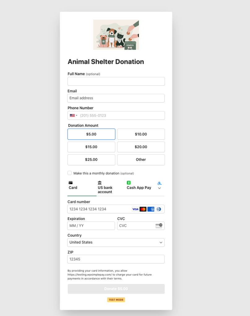
It’s important to place your donation form at the top of the page so visitors can see it right away. If they have to scroll down to find the form, there’s a chance they won’t realize they are in the right place to donate.
If you create a dedicated payment page for your donation form using WP Simple Pay, your form will automatically be front and center because there are no additional elements on the page.
5. Use Concise and Compelling Copy
It’s tempting to tell a long story about the importance of your nonprofit and why donors should send you money, but that rarely serves the donation page’s purpose. By the time the would-be donor reaches your donation page, they have a good idea of what you do and how their dollars will help.
Think about the reasons someone would object to donating to your organization. Maybe they aren’t sure you use their money wisely. Maybe they’re curious about the credentials of your leadership team. Or maybe they want to know about your results.
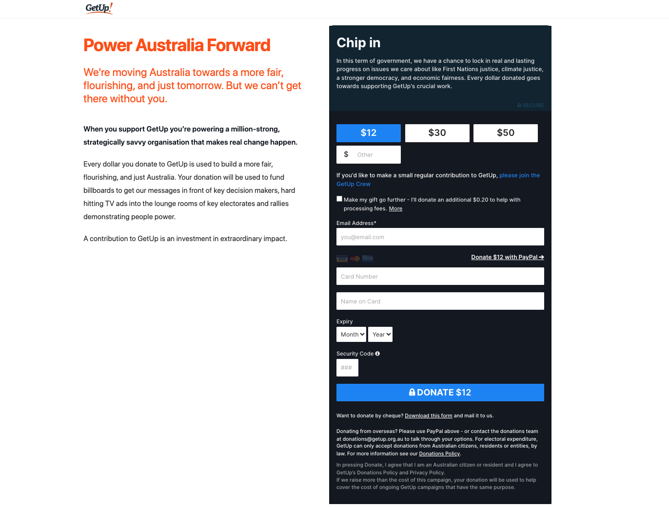
Use the copy on your donation page to address these concerns. Be concise and simple. Limit yourself to a few paragraphs. If you can, reduce your copy to easily digestible lists so people can scan quickly to consume your content.
Notice how GetUp! gets straight to the point with its copy. The page’s sentences are short and to the point.
6. Add Compelling Visuals
It’s no secret that images and videos convey a lot more information than text. They’re usually easier to consume, as well. You can help your visitors understand your cause and the importance of donating by showing them quality photos and videos.
Make sure your imagery meets these criteria:
- Use high-quality images and video. Avoid small and blurry assets.
- Don’t use stock photos. Take custom photos of your organization’s work.
- Include people’s faces wherever possible.
- Fewer carefully selected images are usually more powerful than galleries.
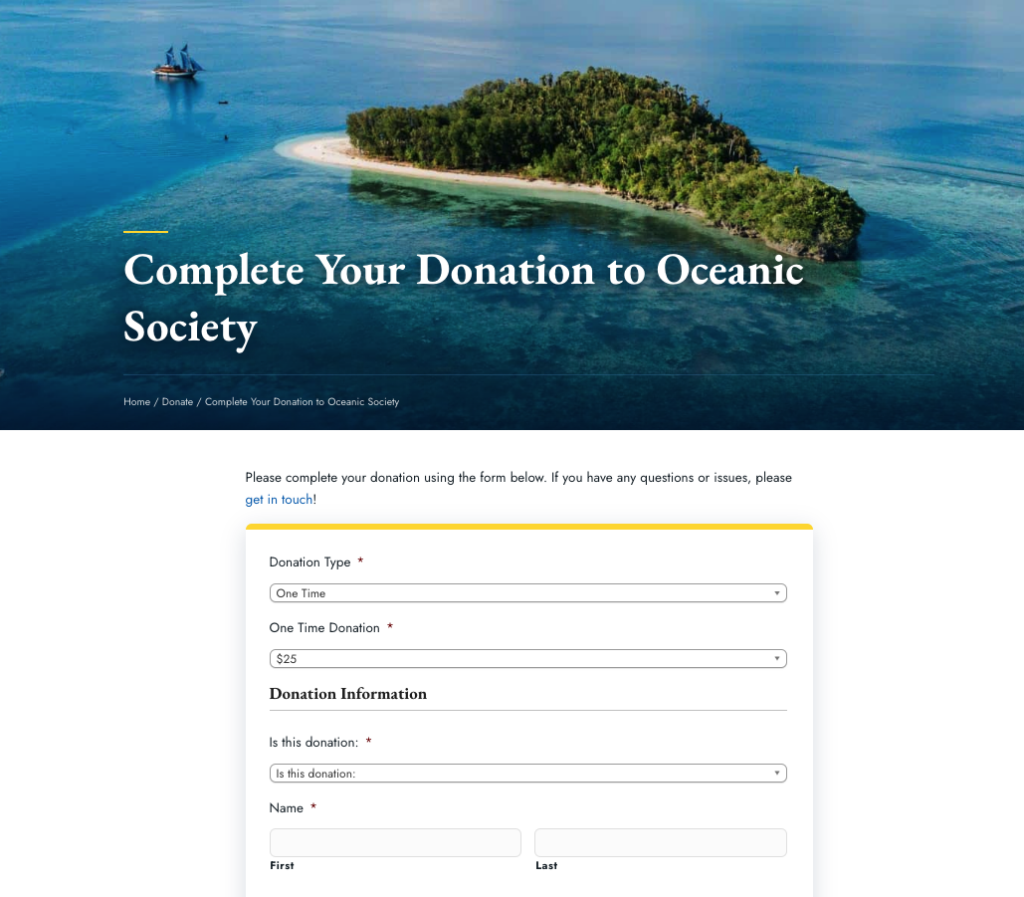
Notice how the Oceanic Society fills the top of its donation page with a close look at its organization’s cause.
7. Include Examples of Impact
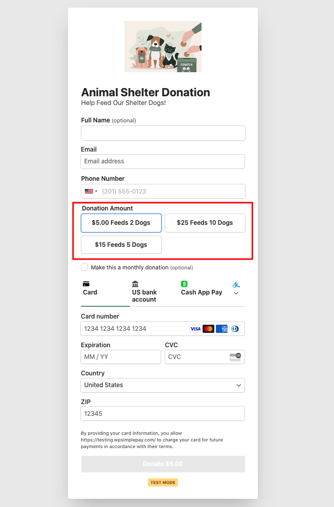
Donors want to know exactly how you’ll spend their money. You probably publish this information somewhere on your site, but it’s important to include it on your donation page as well. Show them exactly what you’ll do with their donations. If you can, break it down based on typical donation amounts.
For example, you might say something like this: “A $20 donation feeds 10 children for a day. A $50 donation feeds 25 children for a day.” Language like this helps them understand exactly how much impact they can have on your cause.
Here is an example of a payment form you can easily create using WP Simple Pay.
8. Leverage Donors’ Self-Interest
Some people like to be acknowledged for their donations. It’s self-centered, but it’s just human nature. You can leverage self-interest by giving your donors a way to broadcast their donation on social media so their friends and family see it. This also helps create exposure for your cause and encourages others to donate.
If you use WP Simple Pay to accept donation payments on your site, you can use the plugin’s built-in automation capabilities to automate recent donation notifications. Recent donation notifications are displayed as popups on your site as soon as someone donates.
You can also create automatic recent donation posts for your Facebook Page. See our step-by-step guide to learn how.
That’s it! We hope this article has helped you learn how to create an effective donation page for your nonprofit organization.
If you liked this article, you might also want to check out our guide on how to increase donations with targeted popups.
What are you waiting for? Get started with WP Simple Pay today!
To read more articles like this, follow us on X.
Disclosure: Our content is reader-supported. This means if you click on some of our links, then we may earn a commission. We only recommend products that we believe will add value to our readers.
