How to Create the Perfect Online Donation Experience (2023 Guide)
Last updated on

Are you looking to maximize donations for your non-profit or charity organization by creating the perfect online donation experience?
In 2022, online giving accounted for 8.7% of all fundraising. In addition, monthly recurring donations made up 28% of all online giving.
In this article, we’ll cover a few easy steps you can take to create an engaging, meaningful experience that educates your visitors on your cause and ultimately drives them to take action.
Reinforce the Impact of Your Cause
Sending a customized confirmation email and creating a donation confirmation message can strengthen the relationship you have formed with your donors and help encourage them to donate on a consistant basis.
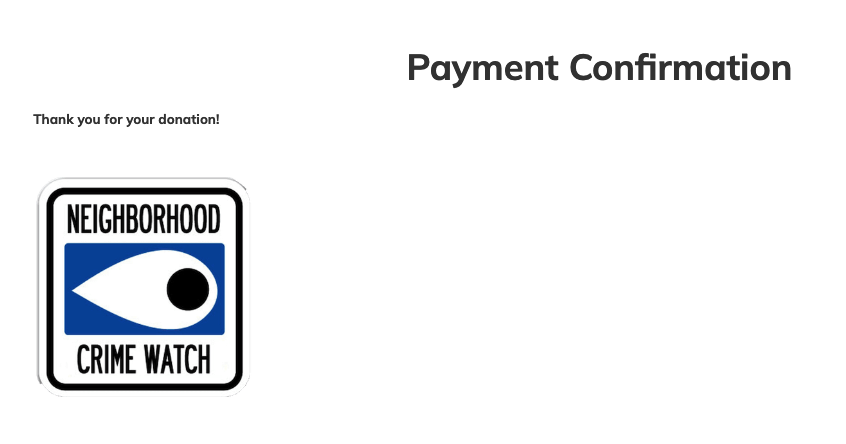
Once donors make a payment, it’s important to follow-up through e-mail. Send a receipt for their records, but also use this message as an opportunity to establish an e-mail-based relationship.
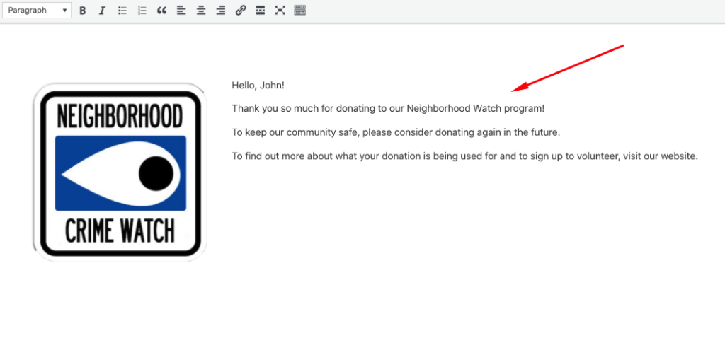
It’s much easier to get donations from past donors than new ones. By continuing your relationship over e-mail, you can reassure past donors that they didn’t waste their money.
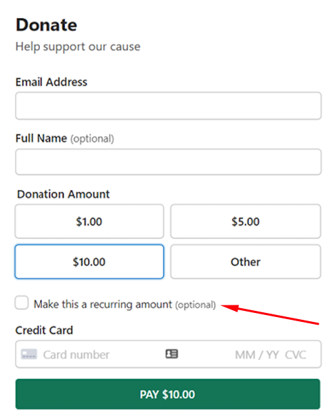
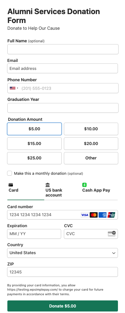
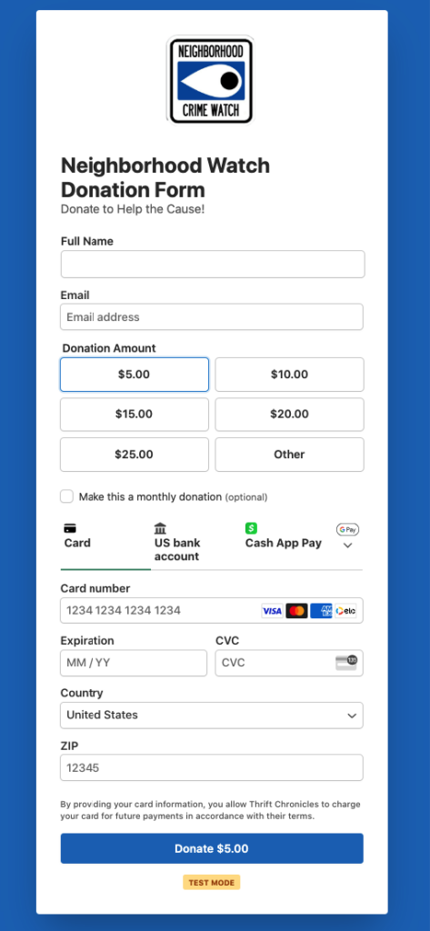
Give Your Donors Options
It’s important to keep your donation process as simple as possible by reducing the number of choices your donors have to make, including how much they’ll donate.
With suggested donation amounts, you can take away any confusion by offering simple increments, like $5, $10, $20, etc. It’s best to offer three or four donation levels. Any more and you risk burdening them with analysis paralysis.
Provide a field for donors to input their own custom amount in case they aren’t happy with the options provided. This gives them an opportunity to donate more than you suggest. It also gives them a chance to donate something, even if they can’t meet your lowest recommendation.
It’s also important to acknowledge that many people can’t give a lot at once, but they’re willing to donate a little bit regularly. Give your donors the opportunity to donate every week or month by suggesting they donate on a recurring basis. This means more revenue for you, a higher donor retention rate, and convenience for your donors.
According to a recent study, only 14% of non-profits prompt donors to make their donation a recurring gift during the checkout process. Consider the donations you have the potential to gain by simply allowing donors to opt-in to recurring payments.
Make Your Donate Button Obvious
This seems like a strange piece of advice, but a lot of organizations (and for-profit businesses, for that matter) fail to make their calls-to-action obvious. They bury their buttons in paragraphs of text, use simple text links instead of colorful buttons, or surround their buttons with lots of images that make it hard to determine what is clickable.
Donation buttons should be above the fold (before the user has to scroll) on each page. Use bright colors that work with your website’s theme, but still stand out on the page.
Most importantly, use clear, action-oriented language on your button that drives the visitor to take the next step. Don’t get fancy here. Just say, “Donate.”
Keep Your Forms Simple
Once people decide to donate (indicated by clicking your “Donate” button), your next step is to guide them through the donation process as painlessly as possible. Each obstacle you put in their way is an opportunity for them to leave the page and forgo donating.
Research from Quicksprout indicates that keeping your form fields limited to three or four results in higher conversion rates. Eliminating unnecessary form fields will significantly impact the success of your donation payment forms.
So, multi-step forms, forms with tons of fields, and forms with questions your donors can’t answer easily are a bad idea. They wreck your conversions. If you want other data points about your customers, you can always get them later through surveys or smart email marketing segmentation.
Finally, make sure to keep your entire form visible on a single page. If donors end up on a second page with additional fields, they might feel overwhelmed and abandon the process.
Creating a distraction-free landing page that’s built specifically for your donation payment form allows your donors to complete their transaction quickly and easily without being distracted by the elements of your current WordPress theme, including headers, the navigation menu, and sidebars.
For more information, read our guide detailed guide on how to accept donation payments online.
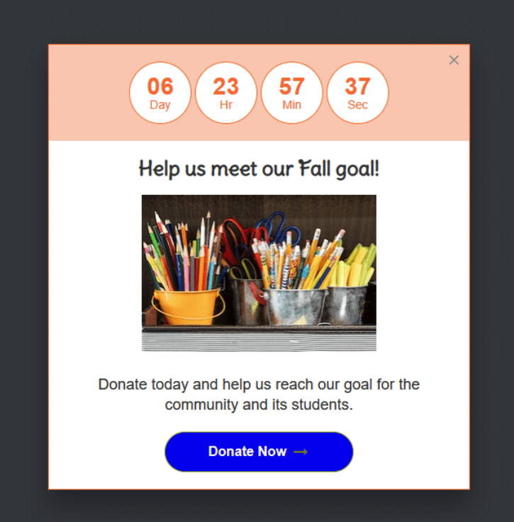
Boost Social Proof on Your Site
A great way to create urgency and exposure around your cause is to automate recent donation notification popups on your site.
They can be easily integrated with your donation payment forms and look like this:

For more information on how to create recent payment popup notifications, see our detailed guide.
Use Targeted Popup Campaigns
With targeted popups, you can ensure that your fundraising campaign is displayed to the right users at the right time.
Targeted popup campaigns encourage visitors to donate to your cause because they reach specific audiences based on location and site behavior, like scrolling, and how much time they’ve been on the page.
You can customize your messages, add timers, and so much more.
Provide Other Ways to Give
Some people may be interested in your cause, but can’t or won’t donate their money. It’s smart to get these people involved in some way by recommending other ways they can give.
For instance, your website might tell them how they can volunteer their time, recruit others, or solicit donations on your behalf. Don’t let these options distract from the main donation call-to-action, but put them on an easy-to-find page.
This technique gives your donors control, choice, and flexibility, which makes them feel far more comfortable getting involved.
Consider the Bigger Picture
While donations are probably the main purpose of your site, don’t focus all of your attention on your donation pages and forms. Not everyone who visits your site is ready to make a donation, familiar with your organization, or even aware of your cause.
Create ancillary value by building out other features, such as…
- An interesting blog full of unique, inspiring stories
- A discussion board for members and non-members to share and support one another
- Educational resources (books, videos, guides, etc.) to educate your visitors
- Resources and tools to help your visitors solve problems or overcome obstacles
- Information about volunteering or meet-ups
These features may not lead to a donation directly, but they inform would-be donors about your cause, make your audience feel comfortable, and help you build a robust community that strengthens your organization’s power and reach. You also give people opportunities to return to your site over and over, which might convert them into donors.
Quick Tips to Create an Engaging Donation Experience
Here are a few more straightforward tips to help you design a donation experience that drives conversions:
- Make your logo and branding visible on every page so donors know they’re donating to the right place.
- Use a menu to help donors navigate your website, but remove the menu on your primary donation landing page. This prevents them from becoming distracted.
- Optimize your page titles for search engines so they find your pages (especially your primary donation page).
- Make sure your entire site (especially your donation pages and forms) are mobile-friendly and responsive.
- Include captivating images throughout your site. As humans, we’re stimulated by visuals. They help us connect with causes and organizations.
Finally, make sure to have regular conversations with your donors. Find out what type of online experience they expect. What would make them donate more? What would have made them donate sooner? Use this information to improve your site.
If you build a donation experience that matches your audience’s expectations, makes them feel comfortable, and drives them to take action, your site will become your most valuable fundraising tool.
There you have it! We hope this article has helped you learn a few new ways to create the perfect online donation experience.
If you liked this article, you might also want to check out 11+ Tips to Collect More Donations on Your WordPress site.
What are you waiting for? Get started with WP Simple Pay today!
To read more articles like this, follow us on X.
Disclosure: Our content is reader-supported. This means if you click on some of our links, then we may earn a commission. We only recommend products that we believe will add value to our readers.