How to Create High-Converting Pricing Tables in WordPress
Last updated on

Are you wanting to create high-converting pricing tables for your product or service on your WordPress site?
Your pricing page is one of the most important pages of your website. If a user arrives on this page, it means they’ve already decided that your product or service meets their needs, and now they want to know what it will cost.
Naturally, a pricing table is the most essential element on the pricing page. A well-designed pricing table helps your prospects understand what you sell, how you deliver it, and what it will cost. A poorly designed pricing table creates confusion and uncertainty, and ultimately sends your prospects to your competitors.
In this article, we are going to cover the fundamentals of effective pricing tables. This advice and the examples provided will help you create pricing tables that educate your prospects and convert them into customers.
Additionally, we’ll show you the easiest way to launch payment forms from Buttons, Pricing Tables, and Call-to-Action modules you’ve created using Elementor and Divi so you can accept payment.
Table of Contents
1. Limit Your Plans to 3-4 Pricing Options
It’s tempting to give your prospects all the options you can, so they’ll choose to buy something, but this often hurts more than it helps. If you give your prospects too many choices, they could suffer from analysis paralysis – the inability to make a decision as a result of overanalyzing data or overthinking a problem. This is sometimes called decision fatigue or the paradox of choice.
When customer support tool Groove simplified their pricing page, they increased free trial sign-ups by 358% and their revenue by 25%.
Here’s what their original page looked like:

And here’s the simplified, higher-converting version:

Groove was able to simplify their pricing into a single plan, but that doesn’t work for everyone. You may need to give your customers a few choices but limit yourself to three or four options.
If you’re willing to customize your offerings for special customers, add a “contact us” link for those types of customers. You might say, “None of these plans meet your needs? Contact us for special enterprise pricing.”
2. Use Straightforward Language
You may have a brand with a quirky personality (and that’s great!), but your pricing table is not the place to get cute with language. If you want people to give you their hard-earned money, you have to be as clear as possible so they aren’t confused about what they’re buying.
When the SaaS DNA project studied dozens of SaaS marketing sites and ran user interviews, it discovered that confusion is an absolute deal breaker. “If potential customers have no idea what your different plans offer, or a solid idea of what it’s going to cost them, then they’re never going to sign up for your service,” the study reports.
For example, instead of describing a feature as “More monthly uploads than you can shake a stick at,” say “Up to 5,000 monthly uploads, which is 50% more than our competitors offer.” Simple and compelling, right?
Let’s go over some more ways to keep your pricing table simple.
Use Columns for Each Tier/Level/Plan
There’s a reason everyone uses adjacent columns for multiple options – they work. Columns allow prospects to compare different offers without jumping around the page.
Make the Differences Apparent
Don’t force prospects to study your plans to uncover their differences. They should be able to look at a pricing column and tell right away how it’s different from the other columns. How you do this will depend on the number of features your plans offer, the importance of those features (some may deserve more attention than others), and what your customers care about.
For instance, you might use strikethrough to cross out features that aren’t part of a particular plan.

Or you might use lighter color text to indicate their absence.

If you have a lot of features that appear in some plans and not others, go with a longer table. Everyone understands checkmarks.

Emphasize Your Prices
It’s not surprising that customers care about price, so don’t hide this information from them. Use clever (but simple) design to make it stand out. Other than each column’s title, prices should be the largest text on the page.
3. Use Clear Names for Your Products/Services
Aside from your prices, the names of each product or service on your pricing table are the most important elements on the page. Prospects will rely on them to understand each column. So if your products and services have ambiguous or confusing names, your prospects will struggle to understand what you’re selling.
Here’s a bad example from Sanebox. What do “snack,” “lunch,” and “dinner” have to do with email inbox management?

Even cliche titles like “bronze,” “silver,” and “gold” aren’t sufficient. These are common, but they don’t tell prospects anything about your offerings.
The best product/service plan titles use words that…
- Relate to the customer or segment
- Address a benefit the prospect wants to achieve
- Connects with the product
Tettra is a great example of effective column titles. If you’re a potential user, you can tell exactly which plan is made for you.

4. Use Smart Price Anchoring
We cover price anchoring in another post, so we won’t dive too deeply here, but the idea is to leverage a psychological effect to steer prospects toward a particular product. It’s a complex process that requires a lot of testing, but the results are powerful.
Read our full guide on price anchoring here: Price Anchoring: Influencing Sales with Different Price Tiers.
5. Use Visual Elements Purposefully
The design of your pricing table is important, but only as it affects the conversion rate. Avoid adding design elements just to make the table or page look pretty. Unnecessary design can make your page confusing and ultimately distract the prospect from consuming the table’s information.
Contrasting colors and sizes are key ways to make certain elements of your pricing table stand out without being obnoxious or distracting. Notice how Wistia makes their preferred plan obvious.

This Freshbooks pricing table uses design elements smartly as well. The illustrations at the top of each column relate to the types of customers who would use that plan. They also highlight their “best value” plan by making it larger than the other columns.

6. Reduce Buyer Friction Points
A friction point is a doubt or uncertainty that might prevent your prospects from buying. You can boost the conversions of your pricing table by anticipating these friction points and addressing them before the prospect abandons your page.
An obvious friction point prospects have is this question: “What if I don’t like it?” You can address this friction point with a simple money-back guarantee. You offer one already, so make sure it’s prominent on your form, especially near the price and call-to-action.
Think about other objections your potential customers might have with your product. Address them either in the columns of your pricing table or just below. Here are some ways you can address those concerns:
- Licenses, certifications, or accreditations your customers expect you to have.
- Security seals or badges that make customers feel safe.
- Testimonials from other customers and/or influential people.
- Information about your product or service that helps your customers compare you to your competitors.
For good measure, throw some frequently asked questions on the bottom of your page. Dig through your email or contact form submissions to find the questions your prospects typically ask. It also helps to add a live chat feature to the page (and your entire site) so you can answer any unique questions in real time.
7. Make Your CTA Prominent
Your call-to-action (CTA) is the button at the bottom of each column your prospects can click to make a purchase (or sign up, register, whatever action you want them to take). This button should be simple and easy to identify.
Most importantly, prospects need to know what will happen once they click that button. So, it’s important to use clear and unambiguous language. A call-to-action button should answer the phrase, “I want to…” That’s why buttons like “register now” or “sign up” are so powerful. Avoid using words like “submit” or “let’s go” because they don’t help the prospect understand where they are in the process.
Creating Pricing Tables
Now that you have a better understanding of what makes a pricing table effective and you’ve seen a few examples of both the good and the not so good, let’s take a look at some ways to launch payment forms directly from them so you can easily accept payment.
The best way to create high-converting pricing tables that allow your customers to complete their transaction is to use a Stripe payments plugin for WordPress that integrates seamlessly with your existing WordPress theme and drag-and-drop page builder.
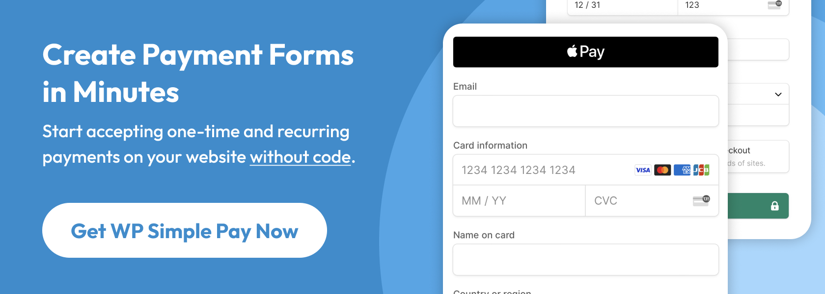
WP Simple Pay, the #1 Stripe payments plugin for WordPress, lets you easily accept online payments on your site without having to set up a shopping cart. It also allows you to create on-site payment forms where your customers can check out directly on your site. You can also host your payment forms on secure, off-site Stripe Checkout pages.
WP Simple Pay even gives you the option to have your payment forms display as an overlay modal.
To learn more about form types offered by WP Simple Pay, see our guide on choosing the right form type for your needs.
One of the best parts about the plugin is that it integrates seamlessly with popular page builder WordPress plugins, including Divi and Elementor, so you can add the pricing tables or single call-to-action buttons you’ve created to your WP Simple Pay on-site overlay forms and off-site Stripe Checkout pages.
Additional features of WP Simple Pay include:
- Accept Multiple Payment Methods: Easily accept 10+ payment methods, including traditional credit/debit cards, ACH Direct Debit, Cash App Pay, Alipay, Affirm, and more.
- Payment Form Templates: Create the perfect payment form in minutes using our pre-made form templates.
- Fee Recovery: Remove the 3% Stripe processing fee to receive the full amount.
- Custom Form Fields: Use text boxes, checkboxes, and dropdown menus to collect additional information from your customers.
- And so much more…
Let’s take a look at two of the ways WP Simple Pay works with Divi and Elementor to create high-converting pricing tables.
Integrating WP Simple Pay with Elementor Tables & Buttons
On the sales page you’d like to add your WP Simple Pay form to, simply drag in the Button, Call-to-Action, or Pricing Table element you’ve created using Elementor and click on it to open the button settings panel. In this example, the button is labeled Click Here.
Next, in the settings panel, click on the down arrow located next to WP Simple Pay, and choose your payment form from the dropdown. Be sure to click Update.
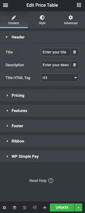
Once you’ve saved your changes, the pricing table button or a single button will launch the on-site overlay form or redirect to the form hosted as an on off-site Stripe Checkout page where your customers can complete their checkout.
Integrating WP Simple Pay with Divi Tables & Buttons
Similar to Elementor, you can add the Pricing Table, Call-to-Action, and Buttons you’ve created using Divi to your WP Simple Pay on-site overlay forms and off-site Stripe Checkout pages.
In this example, we’ll show you how to use Divi’s Call-to-Action element to launch a WP Simple Pay on-site overlay form.
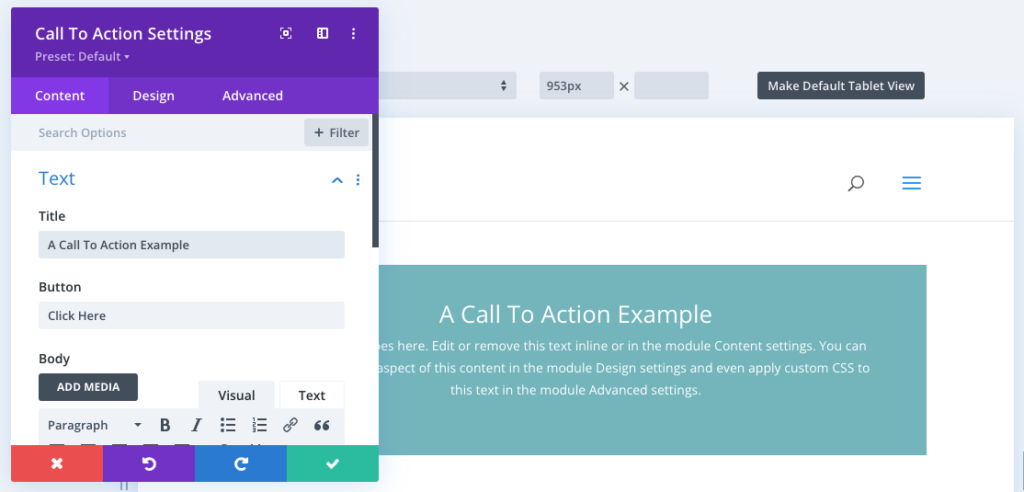
After you’ve finished customizing your Title, and the Button text with your call-to-action, it’s time to add the WP Simple Pay form.
In the Call-to-Action Settings Content tab, scroll down and maximize the Link section.
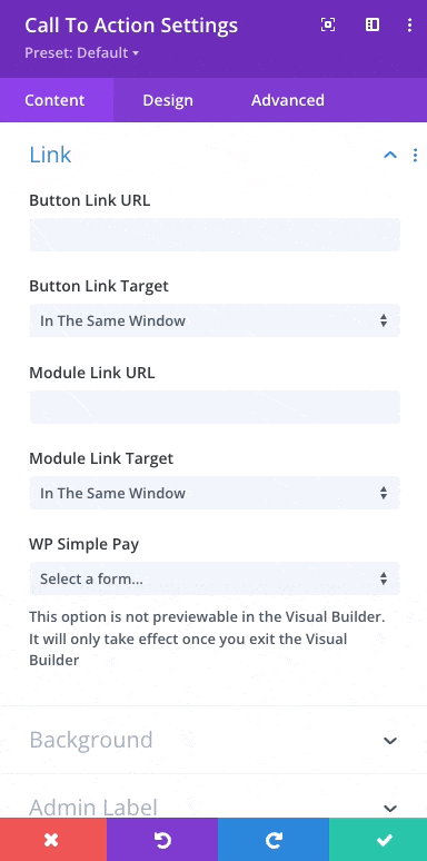
You will need to add a “#” to the Button Link URL field and then select the proper payment form from the WP Simple Pay dropdown. Next, click the green Save check.
Testing Your Results
These tips will help you design a high-converting pricing table, but whenever you optimize anything for conversions, it’s critical that you test your results to make sure you’re moving the needle in the right direction. A/B test multiple versions of your pricing table before deciding on a permanent change. Good luck!
We hope this article has helped you learn more about effective pricing table practices and how to create them for your products or services.
If you liked this article, you might also want to check out How to Accept Stripe Payments in Divi.
What are you waiting for? Get started with WP Simple Pay today!
To read more articles like this, follow us on X.
Disclosure: Our content is reader-supported. This means if you click on some of our links, then we may earn a commission. We only recommend products that we believe will add value to our readers.