What’s Coming in 3.0 Part 1 – Subscriptions Options Screen
Last updated on
Welcome to the first part in an ongoing series showing off what’s coming in WP Simple Pay Pro 3.0.
The release date isn’t set in stone, but we wanted to give you a preview of what you can look forward to as the launch approaches.
Please reply with any questions in the comments.
Massive Shortcodes Begone!
Shortcode Hell. That’s what we’ve put a lot of you through…at least if you’ve needed to go beyond the basics when using WP Simple Pay Pro.
We admit it. As we’ve added features and options we’ve only made the shortcodes you have to edit longer and more complex.
Some of you may be used to this with other feature-rich plugins and themes out there. Or maybe you’re used to it if you’re a long-time WordPress user. But it doesn’t have to be this way.
WordPress is making big strides with simplifying site administration and layout customization, so we’re doing our best to follow suit.
New Subscriptions Options Screen
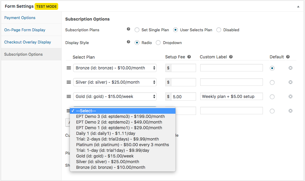
We wanted to give you a taste of what the upcoming version 3.0 form settings area will look like. Here’s new Subscriptions Options screen:

This shows off features you can already accomplish in version 2, but with a much simpler and less error-prone setup. We also retrieve your Stripe plans so you don’t have to hunt them down in a separate tab.
There will be plenty more features coming in version 3.0, including a few more options on this screen, but we’ll save that for another update.
What do you think so far? Do you let your site visitors pick from multiple plans, and if so, does this new layout look it would work for you?
Disclosure: Our content is reader-supported. This means if you click on some of our links, then we may earn a commission. We only recommend products that we believe will add value to our readers.

