How to Optimize Your WordPress Site for Mobile Conversions
Last updated on
 Reviewed By:
 Spencer Finnell
Do you want to optimize your WordPress site to increase mobile conversions?
It’s no secret that mobile traffic grows every year. We use our phones to work, watch the news, play games, and make purchases.
In many cases, we behave differently on our mobile devices than we would on a full-size desktop. We’re less tolerant of long load times, less likely to scroll, and seeking convenience.
With all of that being said, as online business owners, it can be challenging to convince your mobile users to convert into buyers. In fact, checkout abandonment rates are the highest for mobile devices.
In this article, we’ll offer a few best practices that you can apply to your payment forms and pages to help you boost your mobile conversion rates.
In This Article
- 1. Optimize Your Mobile Site’s Performance
- 2. Make Your Site Mobile-Responsive
- 3. Add Trust Badges, Seals and Testimonials
- 4. Offer Digital Wallets
- 5. Remove Popups and Autoplay Videos
- 6. Make Call-to-Action Buttons Big
- 7. Reduce Your Payment Form Fields
- 8. Incorporate Videos for Mobile Viewing
- 9. Develop a Frictionless Mobile Experience
- 10. Test Everything You Change
1. Optimize Your Mobile Site’s Performance
Slow websites aren’t just frustrating. They’re conversion killers. According to a recent study, 57% of online shoppers will abandon the checkout process if it takes longer than three seconds for the page to load. Even just a one-second delay can reduce your conversions.
When pages load quickly, users spend more time on the site and consume more content, which greatly helps increase your mobile conversion rate.
How do you optimize your site’s performance?
- Reduce the number of elements on a page to only what you need to drive a conversion.
- Limit the number of scripts, apps, and third-party tools that make server requests.
- Optimize your images and videos to make them as small as possible.
- Prioritize the order elements load so the user can begin using your pages right away.
- Enable browser caching to reduce the number of times the browser and server communicate.
Google offers mobile tools and resources that you can use to check your site’s mobile-friendliness. You can also use WebPageTest to check the load speed of your pages and get optimization recommendations.
2. Make Your Site Mobile-Responsive
Responsive Web Design is the practice of designing a website that responds to the user’s screen size. It will “collapse” into a design that’s more pleasing for a small viewport.
Most modern website themes are mobile-responsive, but there are still some sites out there that look terrible on mobile devices. These sites’ look and functionality are limited, to say the least. In many cases, potential customers and donors lose trust in sites that aren’t well-designed. Plus, responsive sites are simply easier to use on mobile.
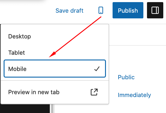
Fortunately, WordPress makes it quite easy to create a mobile-friendly website. All of the themes available on WordPress.org are already mobile-responsive. If you decide to use a third-party theme to create your site, be sure that you choose one that looks good on your mobile device.
As you add elements and content to your site using the WordPress Editor, you can simply click on the Preview icon and select Mobile to see what your site looks like on a mobile device.
3. Add Trust Badges, Seals and Testimonials
We’ve previously shared information about the importance of implementing trust badges, seals, and testimonials on your site. They help visitors feel more comfortable using your site and making purchases by boosting your credibility.

These elements are easy to add to your payment pages and other pages. They work well on devices because the images are generally small. Testimonials can be displayed in simple, quick-to-load text.
Adding a Stripe badge to your payment pages is a great idea if you’re using WP Simple Pay to accept online payments. Customers are more likely to complete their transactions if they see that their payment details are handled by the best payment processor available.
Remove the additional 3% fee!
Most Stripe plugins charge an additional 3% fee for EVERY transaction
…not WP Simple Pay Pro!
4. Offer Digital Wallets
Entering complex information like payment details on mobile devices is tedious and prone to error. Users might abandon your site to avoid dealing with a long-form on a small screen. In some cases, users vow to come back when they get to their desktop but never do.
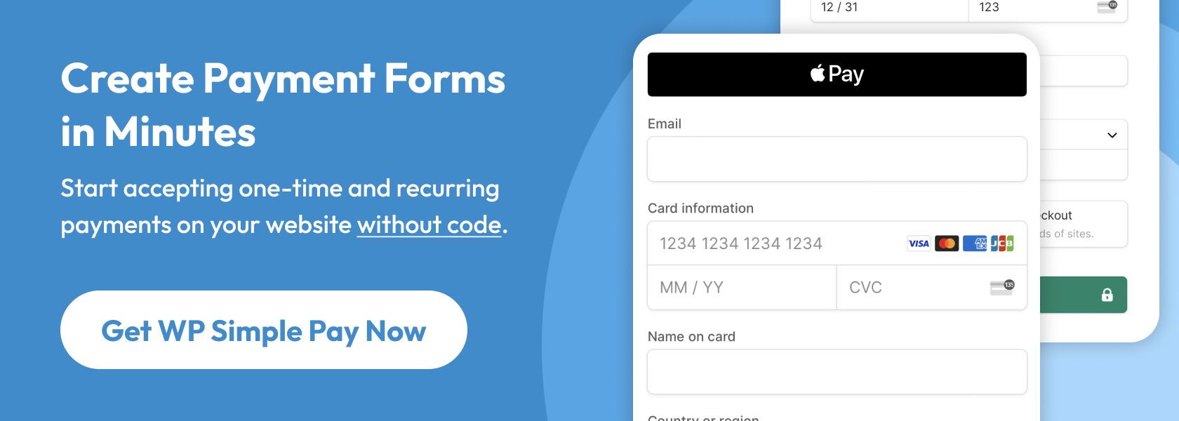
Most consumers are using digital wallets – services that save their payment details securely. Apple Pay, Microsoft Pay, and Google Pay are the most popular services, but there are others.
For example, WP Simple Pay lets you accept Apple Pay/Microsoft Pay/Google Pay, GrabPay, Cash App Pay, and Alipay digital wallets.
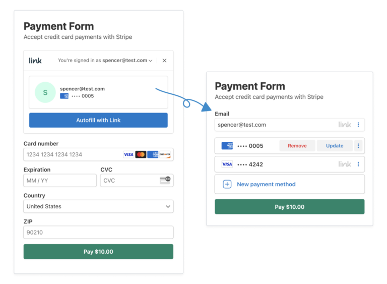
You can also offer Stripe Link on your payment forms, which allows your customers to complete their purchases in far fewer steps using their saved payment details.
To learn more, see our detailed guide: How to Use Stripe Link on Your WordPress Payment Forms.
5. Remove Popups and Autoplay Videos
While popups and autoplay videos have their place, there’s no debate that many users don’t enjoy them. One study surveyed 25,000 people and found that autoplay videos and popups are the least preferred elements of mobile sites.
That’s especially true for the mobile experience. If your users struggle to close popups or turn off videos on their mobile devices, there’s a good chance they’ll just leave. You can display these elements to desktop users, but it’s best not to display them for mobile devices so more users see your content, landing pages, and payment forms.
6. Make Call-to-Action Buttons Big
On mobile devices, many users have trouble with call-to-action buttons that are too small for their fingers. If they have to poke at their screen a few times, they may assume your button doesn’t work, or the product/service is unavailable.
It’s best to make your buttons at least 40 pixels by 40 pixels. For calls-to-action like a “Buy Now” button, make them much larger – ideally, the full width of the screen.
7. Reduce Your Payment Form Fields
It’s generally considered a best practice to reduce the number of fields in a form as much as possible. Fewer fields mean less work for users, which creates more conversions. This rule is especially important for mobile users.
On mobile, forms are painful to complete. Maneuvering between fields with your thumbs is a challenge, even for those with the smallest fingers. Plus, you’re more likely to make errors.
Remove any field that isn’t absolutely necessary to make the sale. Ask yourself if you really need each piece of data. Eliminate the nice-to-have questions that might cost you conversions.
Furthermore, make your fields big and easy to tap. Users should be able to use the “enter” key to jump to the next field rather than having to hit it with their finger.
8. Incorporate Videos for Mobile Viewing
Videos have become powerful conversion tools, even on mobile devices. According to conversion experts at OptinMonster…
- 96% of people have watched an explainer video to learn more about a product or service.
- 89% of people say watching a video has convinced them to buy a product or service.
- 79% of people say watching a video has convinced them to buy a software or app.
Videos are great tools for mobile users because they don’t have to navigate all over a page (which is tough on a phone) to get the information they need. They can sit back and take it in without any hassle.
9. Develop a Frictionless Mobile Experience
In regards to a user’s online experience, “friction” is whenever they experience pain or frustration with your site. For instance, if a user couldn’t find your contact link, they would experience friction. Slow loading, broken links, and low-quality images are more common friction examples.
Browse your website as a user would. Look for barriers or roadblocks that may frustrate them. Do your pages require excessive scrolling? Is your call-to-action hard to find? Is your navigation menu clunky? Are your promotions clear? Is your checkout process simple?
Keep in mind that mobile users are rarely willing to browse your entire website. Don’t make them look for things they need to make a buying decision. For example, don’t put your testimonials on their own page because users won’t go looking for them. They need to be right near your buttons and forms.
It may help to have someone who isn’t familiar with your website give it a once-over to identify problems you may have seen in the past.
To learn more, see our guide: Top Customer Complaints About Payment Forms.
10. Test Everything You Change
We’ve given you a lot of advice to increase your conversions, but that doesn’t mean it will always work for you. It’s critically important that you benchmark your current conversion rate and then test the results of your changes.
To test your changes, you’ll want to use A/B testing. This is the process of splitting your traffic into different versions of your site, with and without the change. This way, you can measure which version performs the best.
Here are a few WordPress tools you should look into for A/B testing:
There you have it! We hope this article has helped you learn more about how you can optimize your site for mobile conversions.
If you liked this article, you might also want to check out our guide on How to Optimize Product and Services Pages in WordPress.
What are you waiting for? Get started with WP Simple Pay today!
To read more articles like this, follow us on Facebook and Twitter.
Disclosure: Our content is reader-supported. This means if you click on some of our links, then we may earn a commission. We only recommend products that we believe will add value to our readers.